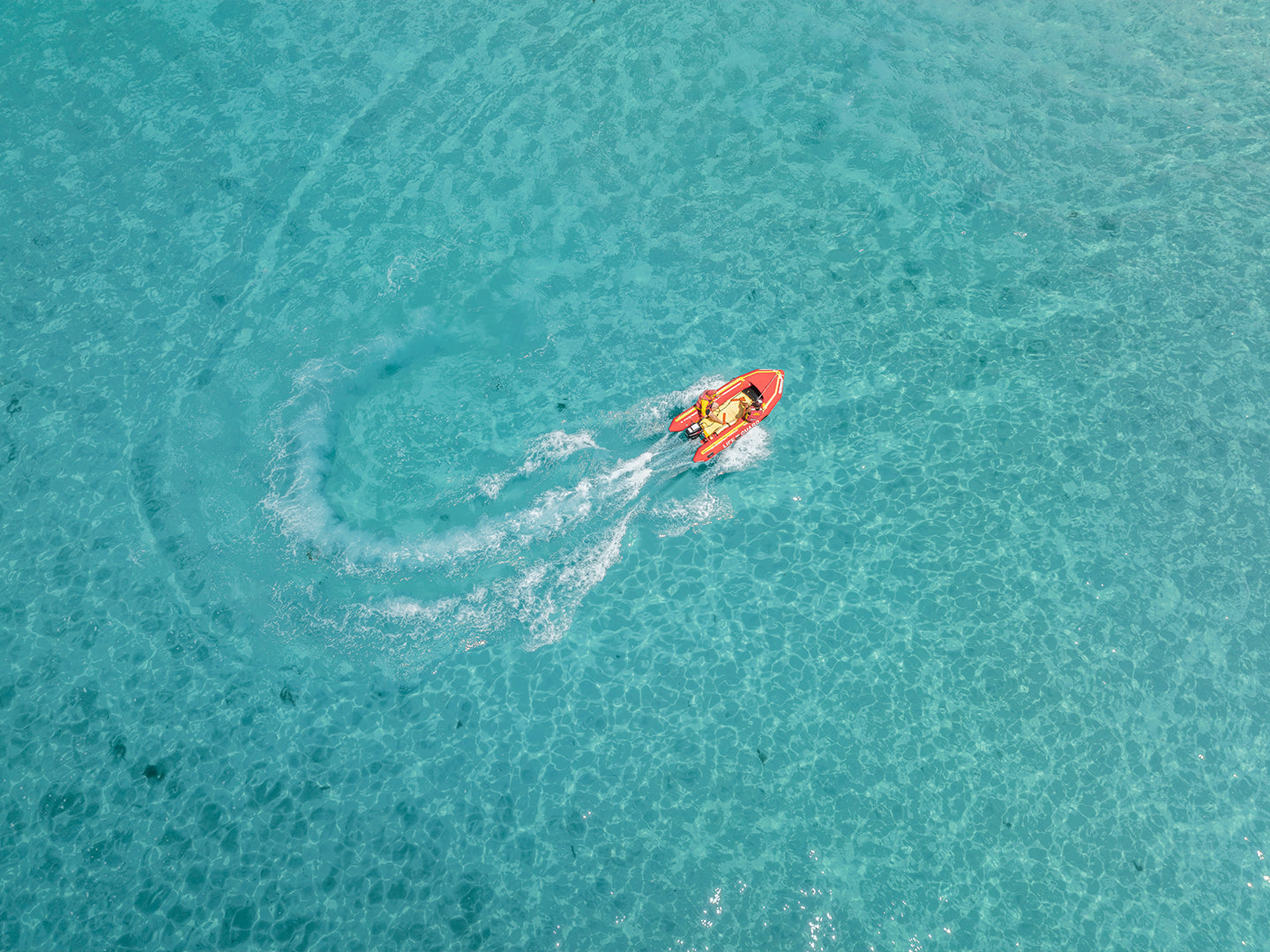
I've been shooting coastal art for years now, and one question comes up more than any other: "Which frame should I go with?" It's a fair question. The right frame can make your beach print feel exactly right on your wall, while the wrong one can leave it feeling a bit off. I've shipped hundreds of prints across Australia, and I've learned a thing or two about what works. Let me walk you through it.
Start With Your Space
Before you even think about frame styles, look at the room where your print will hang. What's already on the walls? What kind of furniture do you have? A sleek black frame looks sharp in a modern apartment with clean lines and minimal furniture. But if you've got a weathered timber dining table and rattan chairs, that same black frame might feel too formal.
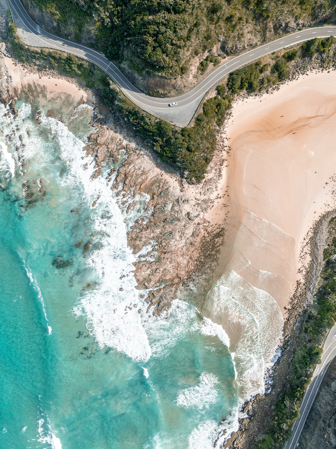
I always tell people to match the frame to the room, not just the print. Your Point Addis Art Print I will look completely different in natural timber versus white, and both can work brilliantly depending on what's around it.
Light-coloured frames (white, natural oak) tend to keep things feeling open and coastal. They're great for smaller spaces or rooms with lots of natural light. Darker frames (black, walnut) add more contrast and can make the artwork pop, especially if you've got white or light-coloured walls.
Classic Frames vs Shadow Box Frames
This is where it gets interesting. I offer both classic frames and shadow box frames, and they create totally different looks.
Classic frames sit flush against the wall with the print behind glass. They're clean, traditional, and work in pretty much any room. If you're after something simple that just looks right, this is your go.
Shadow box frames have more depth. The print sits away from the glass, creating actual shadows and dimension. They feel more premium, more gallery-like. I love them for larger prints where you want to make a statement. The extra depth catches the light differently throughout the day, so your print literally changes as the sun moves.
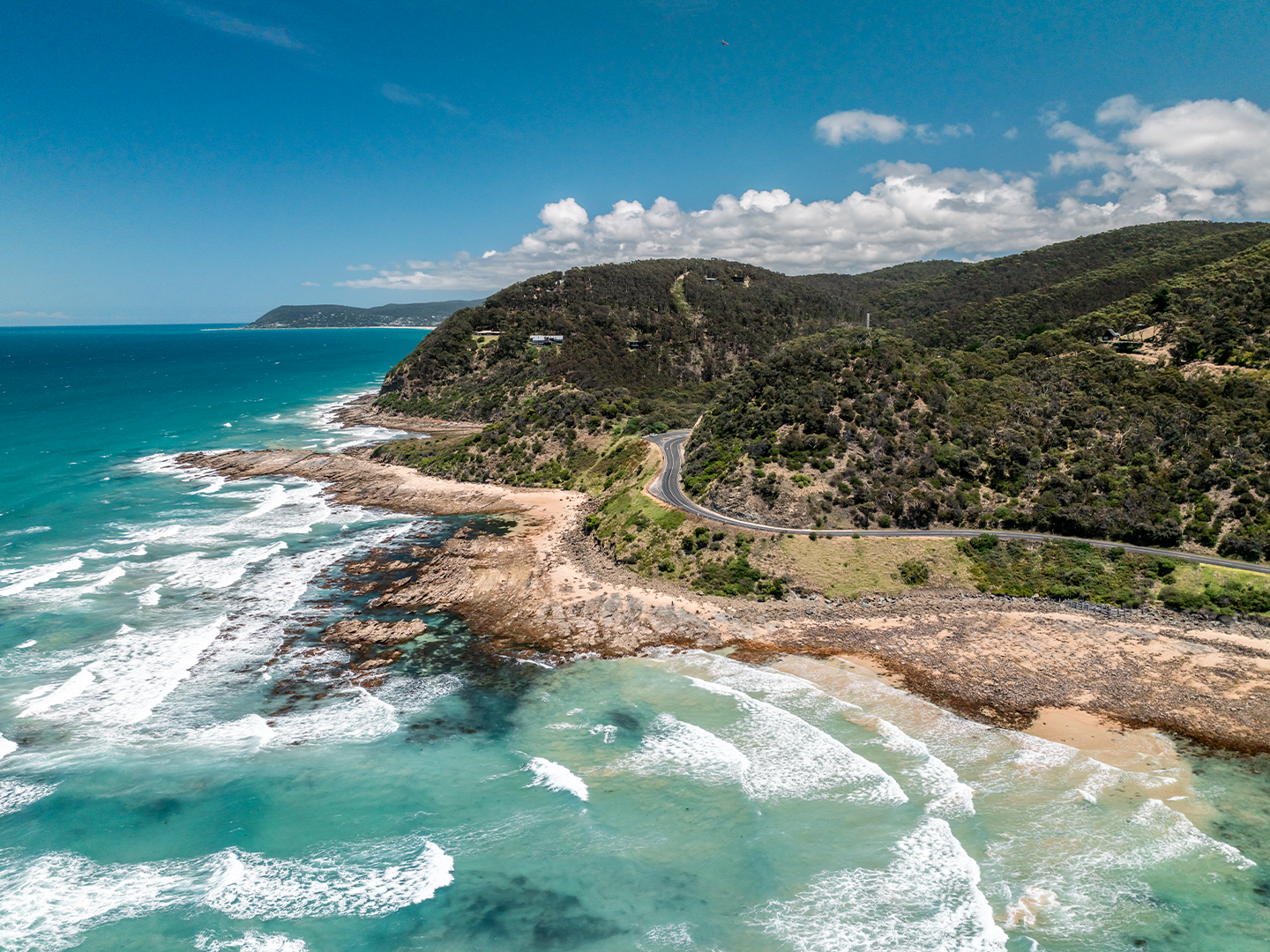
For something like the Bells Beach Art Print I, a shadow box frame adds that extra layer of quality that matches the mood of the shot.
Frame Colour: The Big Decision
Most of my customers choose between four options: natural oak, white, black, or walnut. Here's how I think about each one.
Natural oak is my personal favourite for coastal prints. It's warm without being too yellow, and it brings out the natural tones in beach photography. Sand, rock, weathered timber jetties. They all sing in an oak frame. It's also really forgiving if you're not sure what to choose.
White frames keep things light and breezy. They're brilliant for Hamptons-style homes or anywhere you want the print to feel like part of the wall rather than sitting on top of it. White works especially well with prints that have a lot of sky or pale sand.
Black frames create strong contrast. They're modern, bold, and they make the colours in your print stand out. If you've got a moody ocean shot or dramatic cliffs, black frames amplify that energy.
Walnut is rich and sophisticated. It's darker than natural oak but warmer than black. Great for studies, bedrooms, or anywhere you want things to feel a bit more refined.
Size Matters With Frames
Here's something people don't always consider: the bigger your print, the more the frame matters. A thin frame on a small print looks fine. That same thin frame on a large or XL print can look a bit weedy.
My frames are all made from FSC certified timber, and they're substantial enough to handle larger sizes without looking flimsy. But if you're going for an EPIC print (that's 100x150cm, or 1.5 metres wide), I'd seriously consider a shadow box frame. The extra depth matches the scale of the print.
Take the Coast Home
Every print I shoot comes from a place I know personally. I've walked those beaches, waited for the right light, and captured something worth remembering. When you choose the right frame, you're not just hanging a picture. You're bringing a piece of that coastline into your home in a way that feels true to your space.
All my frames use FSC certified timber, they're made right here in Victoria, and they arrive ready to hang with free shipping anywhere in Australia. Whether you go classic or shadow box, oak or black, you're getting something built to last.
Frequently Asked Questions
What's the difference between a classic frame and a shadow box frame?
A classic frame sits flat against the wall with the print directly behind glass. A shadow box frame has extra depth, so the print sits away from the glass creating actual shadows. Shadow box frames feel more premium and gallery-like, while classic frames are clean and traditional. Both look great, it just depends on the vibe you're after.
Which frame colour is most popular?
Natural oak is my bestseller by far. It works with almost any interior style and brings out the natural tones in coastal photography. White is second, especially for people going for that light, beachy feel. Black is popular for modern homes or when people want strong contrast.
Do I need to upgrade to premium glass?
My premium shadow box option includes Tru Vue glass, which cuts glare and protects against UV. It's worth it if your print will hang in direct sunlight or if you're investing in a larger size. For most situations though, standard glass works perfectly fine and keeps the cost down.
Can I see what different frames look like before I order?
Check out my product guide and size guide pages. They've got detailed photos showing the different frame styles and colours. You can also browse any print on the site and switch between frame options to see how they look.
Still not sure? Pick the one that feels right and trust your gut. You know your space better than anyone.