How to Style a Gallery Wall with Coastal Prints: A Room-by-Room Guide for Australian Homes
I get asked about gallery walls a lot. People love the idea but freeze when it comes to actually doing it. How many prints? What sizes? Does everything need to match? I've helped enough customers work through this that I reckon I can give you a pretty solid cheat sheet. Whether you've got one wall to fill or an entire holiday house to deck out, here's how to style coastal wall art in a way that actually looks good.
Start With the Wall, Not the Prints
Before you buy anything, stand in front of the wall you're working with. Measure it. Is it wide and low, or tall and narrow? A long hallway wall calls for a horizontal row of prints. A tall staircase wall suits a staggered vertical arrangement. A big open living room wall can handle an asymmetric grid.
Most people underestimate the size they need. If you're building a gallery wall with multiple prints, each individual piece can be smaller because they work together as a group. But if you're hanging a single hero print as the centrepiece, go bigger than you think. An L or XL print tends to read much better on a real wall than a smaller one that gets lost. Check out our simple size guide if you're unsure where to start.
Living Room: Let One Print Lead
In the living room, I'd pick one strong hero print and build around it. Something big enough to anchor the space, then two or three smaller prints flanking it or sitting below. Odd numbers tend to feel more natural than even ones.
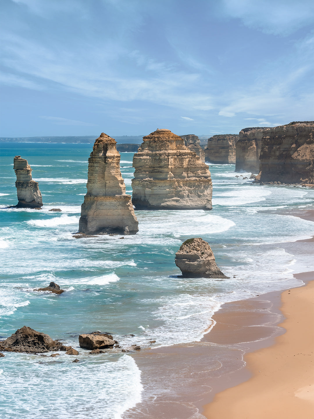
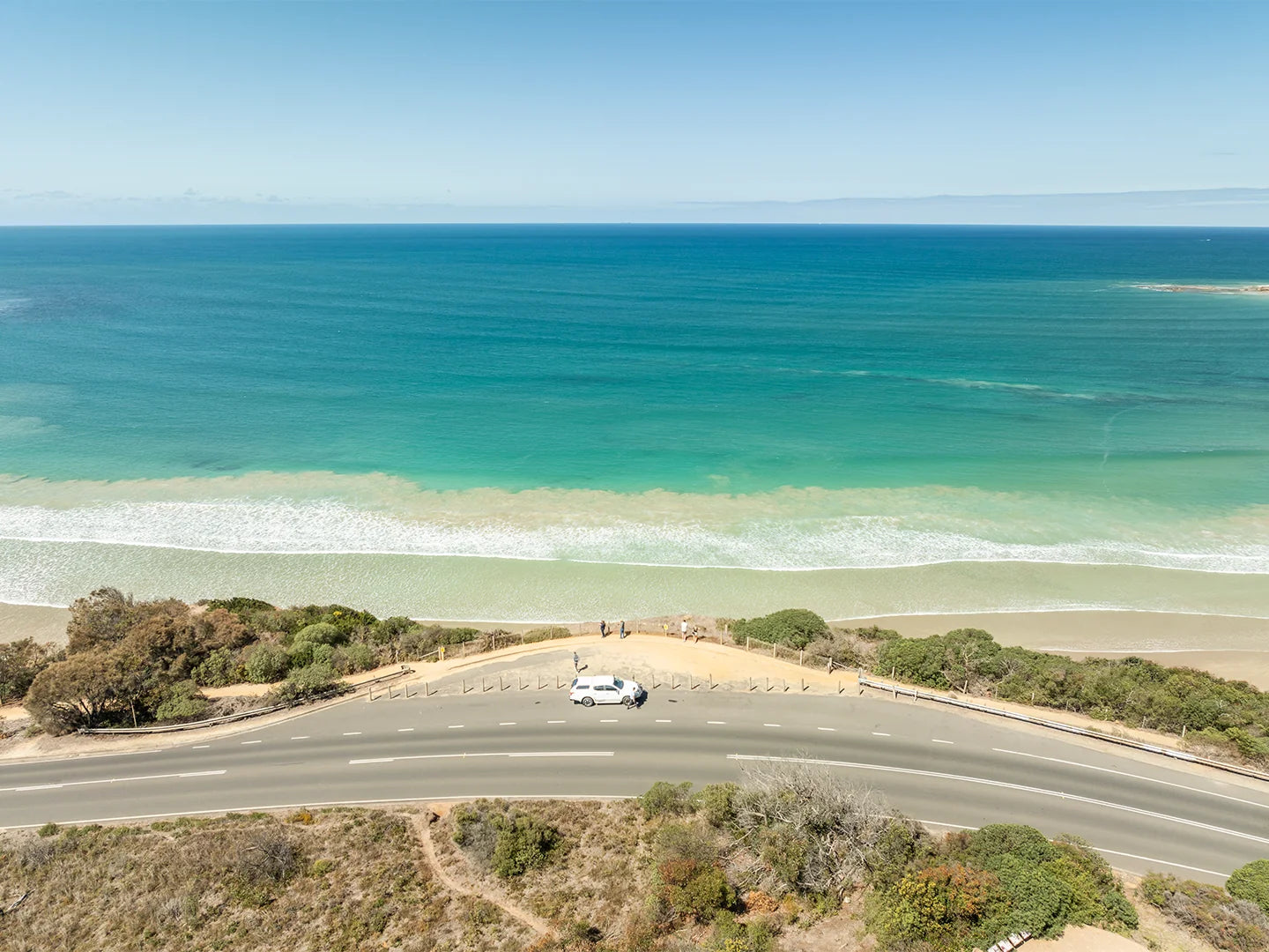
One of my most popular prints for living rooms is Point Addis Art Print I. Shot from above on a still morning, it gives you the whole sweep of that coastline in one frame. It's the kind of image that becomes the centrepiece of a room and starts conversations. Customers have told me they get compliments on it constantly.
For the living room, a shadow box frame looks brilliant. The glass sits 20mm off the print, creating a subtle floating effect that adds real depth to the wall. Available in black, white or oak to suit your existing furniture.
Hallway: Tell a Story Across Multiple Prints
Hallways are made for gallery walls. You've got a long narrow run of wall and people walking past it slowly. That's a perfect opportunity to tell a visual story across multiple locations or moods.
I'd suggest picking prints from the same coastline to keep things feeling cohesive. If you're a Surf Coast regular, for example, you might pair Bells Beach Art Print I with something from Torquay or Wye River. Same coastline, different energy. Hung in a row at the same height, they read like a road trip you want to take again.
In a hallway with limited natural light, a floating frame canvas is worth considering. There's no glass, which means zero reflections no matter the angle. The 400gsm Hahnemuhle Daguerre canvas gives the colours real punch without any glare washing them out.
Bedroom: Keep It Calm but Not Boring
The bedroom is often where people play it too safe and end up with something forgettable. My advice: go bold with the image but keep the framing clean. A crisp white classic frame on a coastal print above the bed looks genuinely great. You don't need to match every element of the room. Let the print bring the colour.
One or two well-chosen prints works better in a bedroom than a busy grid. Give each piece room to breathe.
Holiday House or Airbnb: Go Location-Specific
If you're decorating a holiday house or short stay property, location-specific prints are the smart play. Guests recognise the beach outside the window on the wall. It adds to the experience and guests comment on it. I've had hosts tell me their guests mention the prints in reviews.
Point Lonsdale Art Print IV has been a strong seller for exactly this reason. Hosts on the Bellarine Peninsula have picked it up specifically because their guests know that lighthouse. If you want the full breakdown on choosing prints for a short stay property, my post on best wall art for a coastal Airbnb goes deeper into this.
Mixing Print Types on One Wall
You don't have to stick to one frame style across a gallery wall, but if you're mixing, keep one element consistent. All black frames, different sizes. Or all the same size, different frame colours. Pick your one constant and the rest can vary. A mix of a classic frame and a shadow box frame on the same wall can look intentional if the framing colour is the same across both.
Bring the Coast Home
Every print I sell is shot by me personally at real Australian coastal locations. Nothing is stock. If you've got a favourite beach, there's a good chance I've been there with my camera. Prints start from $89, shipping is free anywhere in Australia, and everything is printed and shipped from Victoria. There's no minimum order and no pickup needed.
If you know the location you want, start there. Browse the full range and find the image that actually means something to you.
Frequently Asked Questions
How many prints do I need for a gallery wall?
Three to five prints is a solid starting point for most walls. Odd numbers tend to feel more balanced than even groupings. Start with a hero print in the centre or at the top, then build outward with smaller prints. You can always add more over time as you find new images you love.
What size prints work best for a gallery wall?
A mix of sizes reads better than everything being identical. For a typical living room gallery wall, try a large or XL print as the anchor with medium or small prints around it. For a hallway row, matching sizes at the same height looks clean and intentional. Our size guide has a visual breakdown to help you choose.
Should all the frames match on a gallery wall?
They don't have to match exactly, but keeping one element consistent helps the wall feel deliberate rather than chaotic. The most common approach is to stick to one frame colour across all pieces, even if the frame style varies. All-black or all-white framing across a mix of print types tends to look really clean.
How do I style coastal wall art in a room that isn't a beach house?
Coastal wall art works in any home, not just beach houses. The key is choosing an image with colours that work with what's already in the room. A great coastal print in a city apartment adds personality and a genuine sense of place. The subject matter doesn't need to match the street outside your window.
Got questions about sizing, frames or which print would work best for your space? Feel free to reach out. I'm happy to help you get it right.