Picking Coastal Wall Art That Actually Works With Your Space
I get this question a lot. Someone finds a print they love, orders it, and then spends three weeks stressing about whether it'll clash with their couch. I've been there myself. Decorating is personal, and getting it wrong feels expensive.
The good news is that matching coastal wall art to your existing decor is a lot more straightforward than most people think. Here's what I've learned from years of shooting and selling beach wall art across Australia, plus the honest feedback I get from customers once their prints go up on the wall.
Start With What's Already in the Room
Before you look at a single print, take a photo of your room. Pull up the colours in your furniture, rugs, cushions and walls. This gives you a reference point.
The goal isn't to find a print that perfectly copies your palette. It's to find one that plays nicely with it. A few things to look for:
- What tones are already dominant? Warm or cool?
- Is your furniture light or dark?
- Are your walls painted a neutral, or do you have a feature colour?
- How much natural light does the room get?
Once you've done that, you'll have a much clearer picture of what kind of print will sing in that space, rather than disappear into it.
Colour Is a Feature, Not a Problem
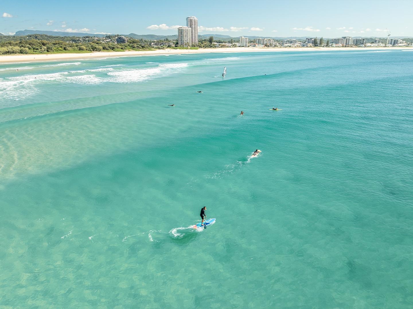
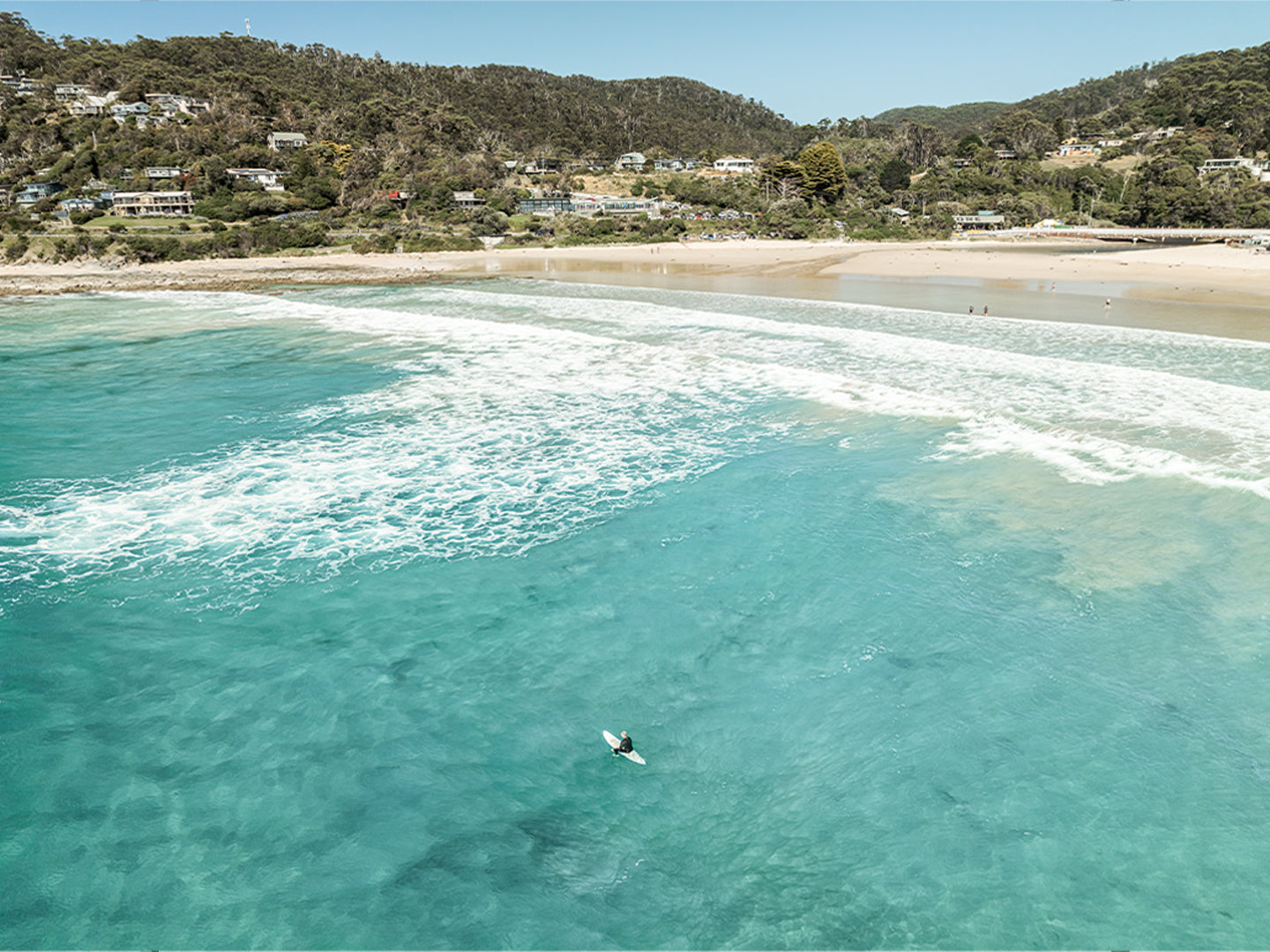
A lot of people assume that the safer choice is a muted, low-contrast print. I'd push back on that. My photography leans colourful because the coast genuinely looks like that. The deep blues of Point Addis, the layered greens of Wye River, the warm golden light hitting the water at Barwon Heads. These aren't colours I've added in post. This is what the coast looks like when you're there at the right moment.
And colour is often exactly what a room needs. Customers regularly tell me their print has lifted the whole space and that guests keep commenting on it. A bold coastal print can pull together a neutral room better than a second neutral print ever could.
If you're working with warm tones like timber floors, rattan furniture, or earthy walls, a print with golden sandy tones and warm ocean blues will feel right at home. If your space is cooler and more minimal, the deep blues and greens of a surf coast aerial shot create a natural contrast that makes the whole room feel more considered.
Match the Frame to Your Furniture, Not the Print
This is the one most people overlook. The frame colour does a lot of the heavy lifting when it comes to how a print fits into a room.
- Black frames suit dark furniture, moody interiors, and contemporary spaces. They make the print feel bold and intentional.
- White frames are the most versatile. They work in almost any space and feel clean and fresh, which suits coastal art perfectly.
- Oak frames are warm and natural. They're ideal for Hamptons-style or rattan-heavy interiors.
All my frames are made from FSC certified solid timber, so they look and feel solid on the wall. The shadow box style is the most popular option by far, where the glass sits 20mm off the print and gives a subtle floating effect that adds real depth to the piece. It's a genuinely premium finish at a fair price.
If your room gets a lot of direct sunlight or has big windows facing the print, the premium shadow box with Tru Vue Museum Glass is worth considering. It blocks 99% of UV and virtually eliminates glare, which is exactly what you want when you're spending good money on a print meant to last. I've written more about it in Tru Vue Museum Glass: Is the Premium Shadow Box Frame Worth It for Coastal Wall Art?
Think About the Size Before You Order
I can't tell you how often someone buys a small print for a big wall and wonders why it doesn't quite land. As a rough guide, most living room walls suit a medium (42x59.4cm) at a minimum. A large or XL print (up to 84.1x118.9cm) creates the kind of impact that actually changes the feel of a room. My EPIC size at 100x150cm is genuinely a statement piece at 1.5m wide, and it's one of the best things you can do with a blank feature wall.
Check out the size guide if you want to see a visual comparison before you order.
Take the Coast Home
If you've got a favourite beach, there's a good chance I've shot it. My bestselling Point Addis Art Print I works particularly well in spaces with cool, natural tones, the blues and greens pull beautifully across the room. If you're after something warmer or more golden, the Barwon Heads Art Print I has those rich tones that pair well with timber and earthy interiors. Prints start from $89 with free shipping anywhere in Australia.
If you're not sure which print to go with, have a look at my full range of coastal wall art and filter by location. And if you want guidance on which size suits your wall, the product guide walks through the options clearly.
Frequently Asked Questions
How do I match coastal wall art to my existing decor?
Look at the dominant tones in your room first, warm or cool, light or dark, and use that as your guide when choosing a print and frame colour. A white or oak frame tends to suit light coastal interiors, while black frames work well in darker or more contemporary spaces. The print itself doesn't need to copy your existing colours, it just needs to feel at home alongside them.
What frame colour works best for beach wall art in a Hamptons-style home?
Oak frames are the most natural fit for Hamptons-style interiors because the warm timber tone complements linen, rattan and white painted walls. White frames are also a strong choice and are slightly more versatile if your decor has a mix of materials. Both options are available across all my framed print styles.
Should I choose a large or small print for a coastal living room?
For most living rooms, I'd suggest going bigger than you think you need. A medium print (42x59.4cm) works on a smaller feature wall, but an L or XL (up to 84.1x118.9cm) is what really makes an impact in a main living space. Undersizing is one of the most common mistakes people make when decorating, and it's an easy one to avoid with a bit of planning.
Does colourful beach wall art work in a neutral room?
Yes, and it often works better than adding another neutral piece. A print with strong coastal blues and greens can bring a mostly neutral room to life and give it a clear focal point. Many of my customers specifically choose their print because the colours complement what's already in the room, picking up tones from cushions, rugs or flooring.
Got a question about a specific print or size? Feel free to reach out. I'm always happy to help you find something that works.