I'll be honest with you. Styling a gallery wall used to stress me out. Too many decisions. What goes where? What size? Do the frames need to match? I've been in enough coastal homes to know the vibe people are going for, and I've also seen enough gallery walls that just... don't quite work. So here's what I've learned, both from shooting these locations myself and from watching how people actually hang and style my prints.
Start With an Anchor Print
Every great gallery wall starts with one hero piece. Something big enough to set the tone for everything else around it. If your wall is wide, go for an L or XL print. If it's a tighter space like a hallway, an M can do the job. The anchor print is what people look at first, so choose something with a strong composition.
My Point Addis Art Print I is my top seller and honestly it earns it. I shot it from above at low tide and the way the water pools in the rock shelf just holds your eye. It works as a centrepiece in a living room or above a bed because there's so much detail to look at. That's what you want from an anchor.
Build Out With Complementary Sizes
Once you've got your anchor, you want to build a layout around it. The classic approach is a large centre print flanked by two smaller ones at different heights. You can also do a column of three prints stacked vertically, which works really well in hallways or on narrow walls next to a door.
Keep the gap between frames consistent. About 5 to 8cm between prints feels right. Too close and it looks cramped. Too far and the prints don't read as a group. Lay them out on the floor first, seriously, it saves so many nail holes.
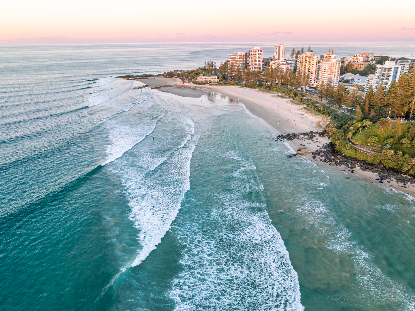
For coastal wall art in Australia, I'd suggest mixing locations if you've got a connection to a few different spots. A Barwon Heads Art Print I next to a Bells Beach print, for example, tells a story about a stretch of coast you actually love rather than just filling space with pretty pictures.
Framed or Unframed: What Works Best in a Group
For gallery walls, I'd always lean toward framed. Unframed prints are great as singles but in a group setting, frames give each piece a proper edge and stop everything from blurring together visually.
My frames are FSC certified timber, so they're the real deal, not cheap flat-pack stuff. For a coastal home, the classic framed print or the shadow box frame both work well. The shadow box gives prints a bit of depth and makes them look like they've been properly considered, not just chucked up in a hurry.
If you want something that really holds up as beach wall art in an Australian coastal home, the premium shadow box with Tru Vue glass is worth it. Reduces glare, brings out the colour in the print, and looks sharp from every angle.
Colour and Tone: Keep It Cohesive
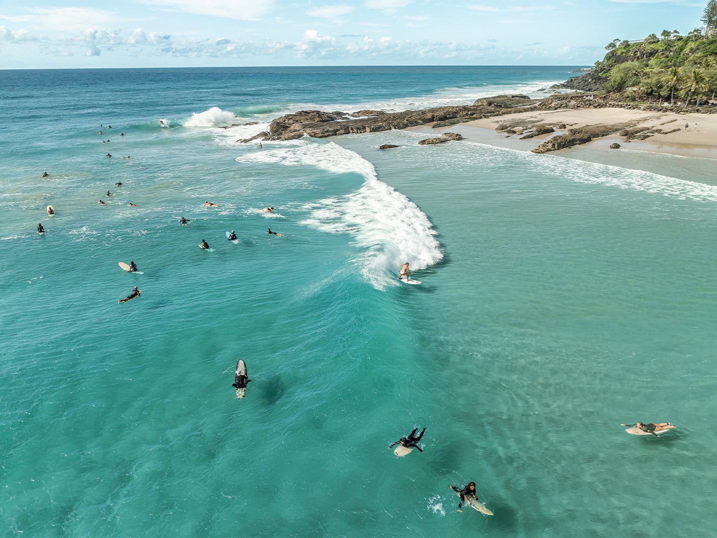
You don't need to match locations, but you do want the prints to feel like they belong together. Look at the overall palette. Blues, sandy neutrals, early morning light. Most of my coastal prints share a natural tonal range because I'm shooting real places in real light, not editing things to look dramatic.
If one print is a moody overcast morning shot and the next one is a midday aerial with electric blue water, they'll fight each other on the wall. Think about what mood you want the room to have and choose prints that sit in the same emotional register.
Take the Coast Home
The whole point of a gallery wall in a coastal home is that it should feel like the places you actually love. Not a stock image someone else took. Not a generic wave print from a big box retailer. Something real, from a real place, that you've actually stood at and felt the salt air on your face.
Every print I sell, I shot myself. I know these spots. I know what time of morning the light does something worth capturing. That's what you're putting on your wall.
If you're not sure where to start, check out the Point Roadknight Art Print II. It's one of my most popular prints and works beautifully as a centrepiece or as part of a Surf Coast gallery wall. All prints ship free anywhere in Australia, printed and ready to hang.
Browse the full range and see what speaks to you at localbreaks.com.au.
Frequently Asked Questions
What size wall art should I choose as the centrepiece of a gallery wall?
For a living room or bedroom gallery wall, an L size (59.4x84.1cm) or XL (84.1x118.9cm) works well as the anchor piece. Go bigger if your wall is wide and you want the gallery to feel bold. Once you have the centrepiece, build smaller prints around it in sizes that step down gradually.
How many prints should a coastal gallery wall have?
Three to five prints is the sweet spot for most walls. Fewer than three can feel sparse and more than six starts to look cluttered unless you have a very large wall to work with. Odd numbers tend to look more natural than even ones, so three or five is usually the way to go.
Should all frames match in a gallery wall?
Matching frames give a gallery wall a clean, cohesive look, which works especially well in coastal and modern interiors. If you want a more relaxed feel, you can mix frame styles but keep the colour consistent, all natural timber for example. Mixing both frame style and colour is where it tends to go wrong.
What is the best type of wall art for a beach house or coastal home in Australia?
Framed prints with real coastal photography work best because they feel personal and specific to place, rather than decorative and generic. For Australian coastal homes, prints from locations like the Surf Coast, Bellarine Peninsula or the Gold Coast connect the space to places people actually know. A shadow box frame adds depth and suits the relaxed aesthetic of most beach house interiors.